Attendance Card Click State UI Enhancement
What is the goal?
Improve the clarity of the UI feedback when a user is marked for attendance by making the card styling more visually distinctive.
📋 Requirements
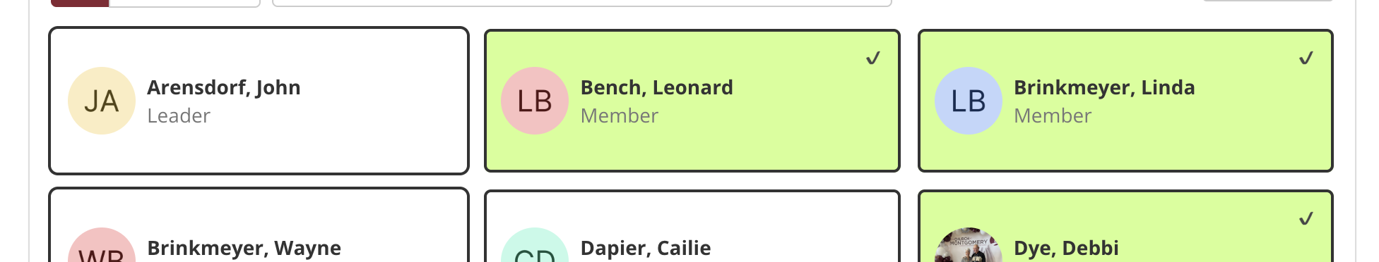
As-Is:
- 2px outline in orange when someone is marked for attendance
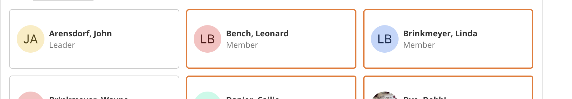
To-Be:
- 2px outline
#333 - Light green background
#aaff008c - Checkmark icon
✔️in top-right corner - Smooth toggle state on click/tap
- Must work on mobile + desktop (pointer events)
- Must toggle state of 'checked' / '!checked' as for bootstrap's boolean styling on the class name