Trending
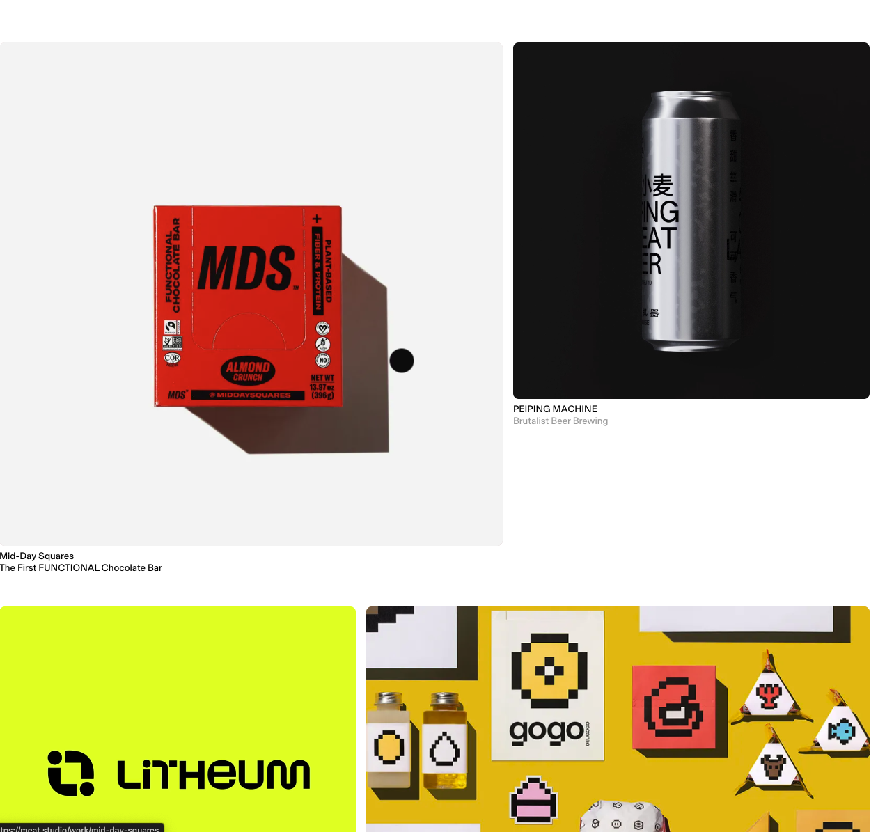
First step in placing our brand just in front of the mids is taking a pulse of trending takes.
Wastefully Edgy. . . . . . . . . . . . . . . . . . Mid . . . . . . . . . . . . . . . . . .Uninspried
Dovetailing
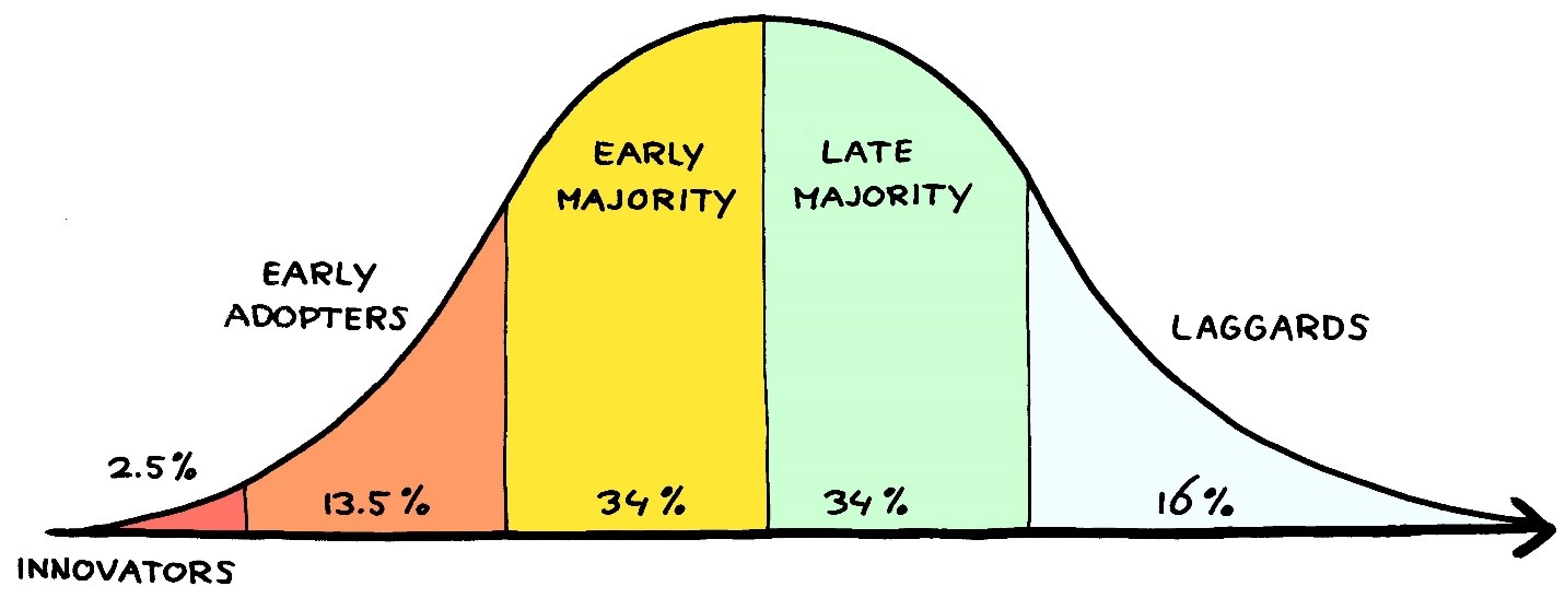
Integrating design elements through dovetailing techniques can help break away from the modular, blocky 'human' formula and lend the user a sense of a 'divinely inspired' feel. Micro elements excel at this. From the perspective of material design, imagining materials being joined together akin to a dovetailing effect can blur the lines between elements, enhancing the user experience.
Perspective
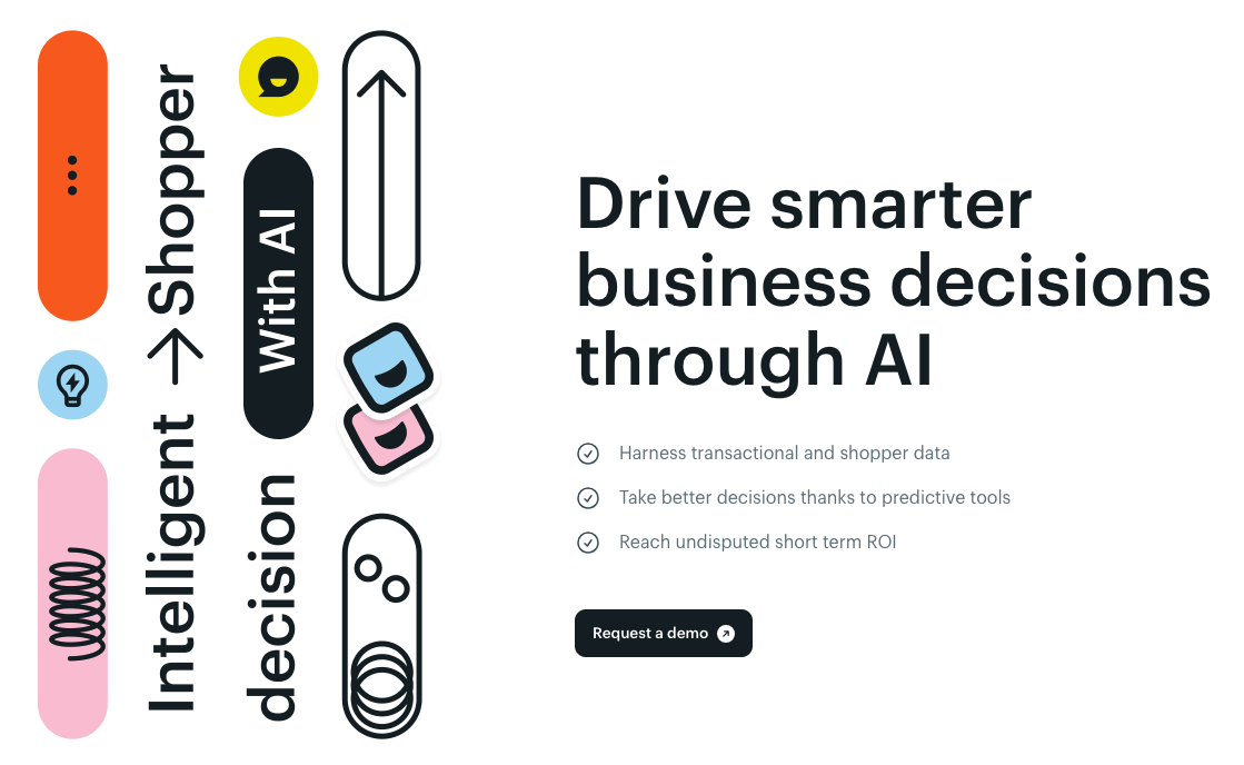
Flipping the perspective/axis is an easy way to command attention to a design element.
Microinteractions and Micro Design Elements
Subtle animations and feedback elements enrich user experiences by adding interactivity and charm to interactions. Goes a long way. Salt and pepper to perfection. Here is a great example of micro elements dovetailing blocks.
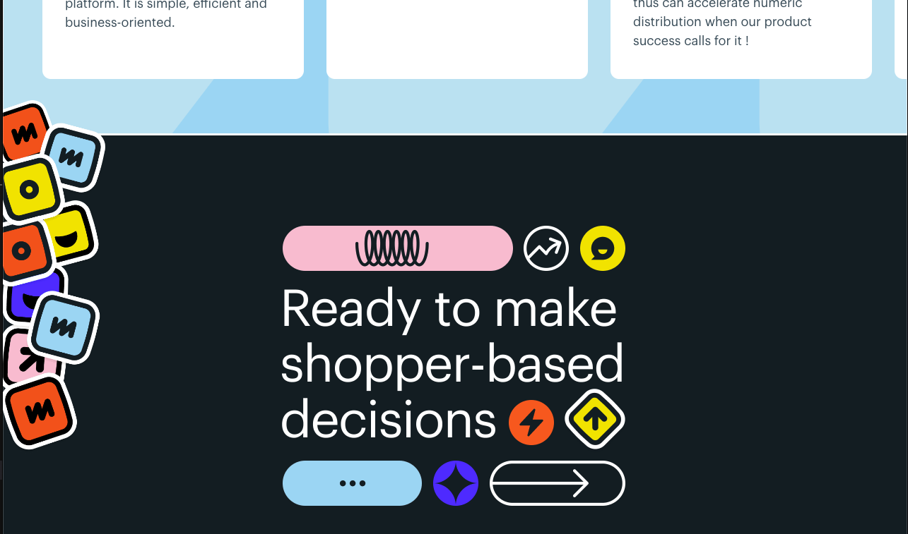
Dark Mode
Dark mode remains a very popular design choice for its visual comfort and energy-saving making it easier to focus on content, especially in low-light environments.
A great way to offer up a more sleek and modern viewing experience for those who are interested in using it in that way while no also having no alterations for those who don't. Put another way, it is a unique design choice that can serve both younger and older audiences while only bring a value add to each.
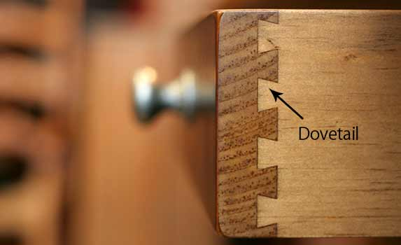
More on that... we could use dark mode as the signal from the user that they are more on the early adopters/majority side of the adoption curve for not only that but design ideas on the whole and use the dark mode toggle to push even more forward design elements to the user. "Dark Mode" is just our internal name for more trendy choices. Starting small... fonts and only on the main page. Dark Mode also comes with a more modern font suite.
For example: This site has a great dark mode feature.
Bold Typography
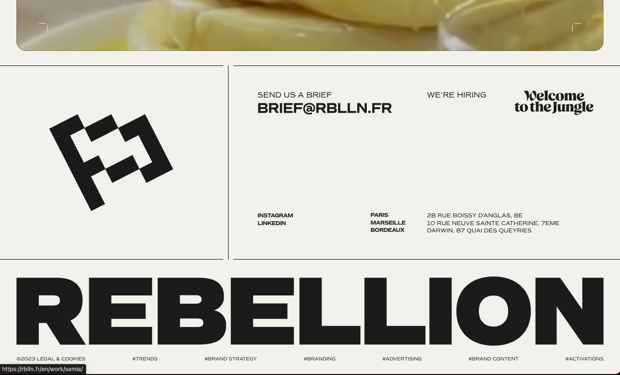
Bold typography is an underused design element to command attention and convey confidence. Super versatile for emphasizing key messages and reinforcing brand identity.
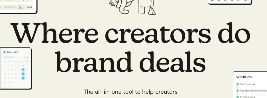
Highlighting
Add weight and importance w the traditional highlighting approach. Very popular + lots of ways to do so, the entire word, just the bottom, material/handrawn etc.

Textured Gradients
Textured gradients add depth and visual interest to designs, combining smooth transitions with tactile sensations. They're great for evoking emotions, enhancing storytelling, and creating memorable user experiences both as backgrounds and even design pieces.
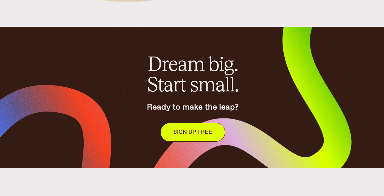
Glowing
The gradient affect has pushed into what I am calling the "glowing" affect.
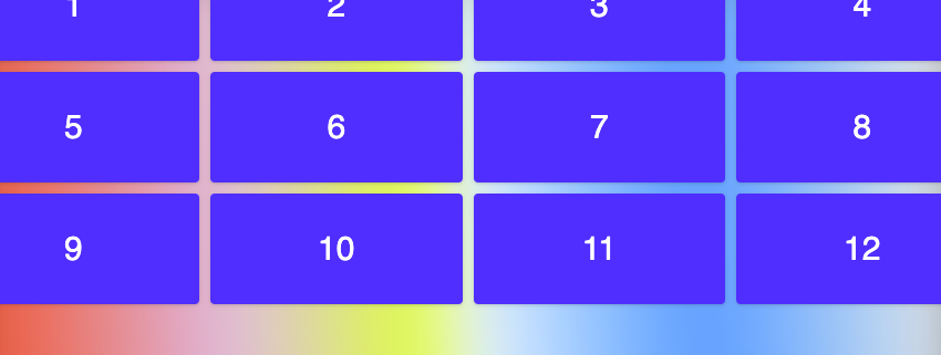
Parallax
Parallax scrolling adds a sense of depth and immersion to websites, making them more interactive and engaging. It's perfect for guiding users through content and creating dynamic storytelling experiences. This is really complicated and def can lead to a dizzying affect. Might be done to a small degree to achieve large returns. Ex. Setting cards and assets as user scrolls them into view. In practice, setting a max px movement might be a good box to place around all things parallax.
Brutalism
Brutalism challenges conventional design principles with its raw and unpolished aesthetic. It's bold, memorable, and perfect for standing out from the crowd in web design. By polarizing things like size, clarity (think 8-bit impressions of things vs crystal clear), think ultra thick weights vs 1px borders.
Asymetry
To help break the molds, building asymetry in the form lends to a more inspired experience for the user. 